The question came from Maurice de Kunder in 2006, when he was my student at Tilburg University’s Tilburg School of Humanities and Digital Sciences (as it is now known). We decided to take the question head-on and adopt a simple word frequency-based heuristic: we would repeatedly ask search engines for the number of pages that would contain specific words, and we would produce an averaged extrapolation of the total number of pages in the index. The words were taken at log-even intervals on a Zipf curve, computed on an internet corpus, DMOZ, that at the time was huge.

The answer is: it varies, but it has been about 40 billion pages for the past months. We know this because the data collection never stopped. Longitudinal experiments in NLP and information retrieval do exist! Maurice, who became an internet entrepreneur, moved his Master’s thesis work to https://www.worldwidewebsize.com/ – which has been running and updated ever since. Maurice has been editing his scripts occasionally and there is some data loss here and there, but there is still one large ever-increasing database of results.
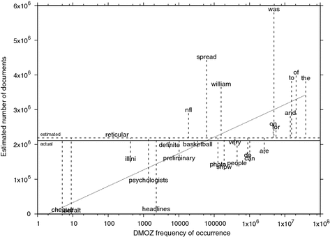
Labeled scatter plot of per-word DMOZ frequencies of occurrence and estimates of the Wikipedia test corpus. The x axis is logarithmic. The solid horizontal line represents the actual number of documents in the Wikipedia test corpus (2,112,923); the dashed horizontal line is the averaged estimate of 2,189,790. The dotted slanted line represents the log-linear regression function x = (204,224 * ln(x)) – 141,623.
In 2016 (looking back on the first 9 years) we published an article in Scientometrics about our method, offering some insights and warnings about the sometimes extreme variability of reported numbers by search engines. The article is here. It offers details on the frequency-based selection of words and on a partial explanation of some of the variability written by Toine Bogers (which we could often link to publicly announced changes in search engines).
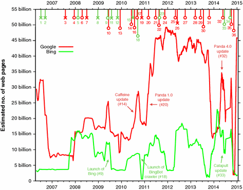
Estimated size of the Google and Bing indices from March 2006 to January 2015. The lines connect the unweighted running daily averages of 31 days. The colored, numbered markers at the top represent reported changes in Google and Bing’s infrastructure. The colors of the markers correspond to the color of the search engine curve they related to; for example, red markers signal changes in Google’s infrastructure (the red curve). Events that line up with a spike are marked with an opened circle, other events are marked with an “x”.
Digital experiments, software, and data tend to have a much shorter lifespan than you would want from the viewpoint of replicability. At least I’m happy to report one counter-example; a proper living fossil.